Under The Microscope


Author Archive

All-Up: What the Moon Landing Can Teach Us About Design

An all-up process is good for more than just landing on the moon.

At the start of the ’60s space race, NASA was wary of changing too many things during any one launch. The intention was to keep each launch controlled, much like a scientist only changing one variable in each iteration of an experiment.

This conservative approach was safe, but it was also very, very slow. To hit the goal of putting a man on the moon by the end of the decade, the head of the Office of Manned Space Flight George Mueller knew that NASA needed to change its approach. He instituted a new testing philosophy dubbed “all-up”. This involved including many systems in each launch, even if they weren’t fully baked. If they weren’t believed to be a large liability, they flew. This strategy ultimately saved both time and money, and it’s hard to argue with the results:


Buzz Aldrin getting results.
[Photo credit: NASA]

Using All-Up in Design

Audio software isn’t rocket science, but it can still get pretty complicated. I try to embrace an all-up mentality wherever I can here at Rogue Amoeba.

Let’s take, for example, one of our product pages. After our initial planning session, I first do a super quick pass on all the elements. I make rough versions of everything I can. I use stock icons, I improvise text, I cobble together code from other projects or snippets. If I don’t have a good feature icon concept, I don’t dwell on it. I just use a placeholder and move on. The goal is to get everything up, connect links between pages, and establish a rough aesthetic.

Worth noting, except for longer passages like articles, I try hard to avoid using designer crutches like lorem ipsum. The eventual text is part of the design, and so we try to make even the first draft mimic what we expect to eventually see.

Sometimes, quickly writing in placeholder text can even result in usable copy. I improvised the first draft of what would become a tagline for SoundSource, “Sound control so good, it should be built in”, and it stuck.

My intention with this process is to get things “all-up” and have a passable first draft. Once we have that, we can work on improvements.

Iteration

Those who follow popular design chatter might recognize all-up as a form of iteration, and that’s exactly right. The goal is to get as much up as fast as possible, and then build on it. Part of the key to this is to iterate on things in place as much as possible.

In his architecture book “The Timeless Way of Building”, Christopher Alexander advocated starting work on a design for a building by visiting the construction site, walking around, and placing wooden poles in the ground to represent the different rooms and spaces the building would have. Alexander found this helps him visualize things at the real scale the building will eventually have.1

Alexander wrote:

Then we began with the design itself.

It took a week, Monday to Friday, out on the site itself, walking around parked cars and obstacles, overcoats against the fog, walking, walking all day long, cups of coffee, crazy dancing around, as the building took shape, chalk marks on the ground, stones to mark corners. People wondered what on earth we could be doing out there in the fog, walking around, all day long, for so many days.

The point of Alexander’s exercise is to remove as much abstraction from the process as possible. Rather than focusing solely on blueprints, he keeps everything at a human scale, and also going to maximum length to make sure the building design takes into account the context of the environment around it.

In a similar way, I like to design with the least abstraction possible, and like to jump pretty quickly to working in the direct medium. I often jump into the HTML and CSS early on, instead of making a pixel-perfect site mock-up with a design app like Photoshop or Sketch. This makes updating text pretty quick, and helps create a good sense of how the pages will work alongside the rest of our site.

Working Through Issues

One big benefit of the all-up process is that it leaves fewer places to get stuck, because getting everything perfect right away is not the goal. I’m a big advocate of quickly moving on to the next task the second you get stuck on something.

There will always be stumpers that threaten to derail the design process. Following this all-up thinking and having everything roughed out in place means there are many different elements to look at and work on improving. Stuck on icons? Work on the layout. Stuck on designing an interaction? Work on improving the writing.

Building Trust Within the Team

The all-up approach requires a fair amount of trust between team members. As a designer, I find it nerve-wracking to present anything that isn’t super polished. The whole team needs to have enough trust in the process and the design team for it to work. I have to trust that the team will see what I intend, and the team has to trust that I can get us where we need to be in the end.


[Photo credit: NASA]

Try All-Up Yourself

In the right context, all-up can be a super-effective process. It worked to put astronauts on the moon, and it can work for designing web sites, audio apps, and almost anything else you’re working on.


Footnotes:

  1. While designers and information architects often love Christopher Alexander, almost every architect I talk to hates him with a strange passion. Beware of this when trying to seem cool to your architect friends. ↩︎

The Design of SoundSource 4

Enjoy a behind-the-scenes look at the design process for SoundSource 4.

At the end of March, we unveiled an all-new release of SoundSource, our powerful system-wide audio controller. SoundSource can help every Mac user who uses audio, whether you’re streaming music, participating in voice chat, or just watching videos.

Last month’s release was officially SoundSource version 4.0, but that doesn’t really tell the whole story. Despite its version number, SoundSource 4 is an entirely new app, with massive updates over what came before. Here’s a side-by-side comparison:

Unlike some more linear updates, the design and conceptualisation of SoundSource 4 began from a nearly blank slate. This is a story of how we got to our eventual release.

Starting With Posture

Whether intended or not, every app has what design researcher Alan Cooper calls a ‘posture’. From Cooper’s essential interface design book “About Face”:

Most people have a predominant behavioral stance that fits their working role on the job. The soldier is wary and alert; the toll collector is bored and disinterested; the actor is flamboyant and larger than life; the service representative is upbeat and helpful. Products, too, have a predominant manner of presenting themselves to users.

A workhorse app like Photoshop or Sketch, for example, takes over most of the screen and has what Cooper would call a ‘sovereign’ posture. These are apps you spend hours upon hours in. They tend to have a lot of features, and a correspondingly sprawling interface.

SoundSource is very different, as it works for you in the background, nearly invisibly. It needs to stay out of the way, so the user can accomplish other things. Occasionally, SoundSource needs to be accessed for a quick tweak, then just as quickly hidden away. It has a ‘transient’ posture.

Understanding that transient posture was essential to the app’s design. With this in mind, the menu bar was the obvious home for SoundSource. Making everything we wanted fit into the tight constraints of a menu bar app proved to be an interesting design challenge. At times, it felt more like working on a mobile app than a traditional desktop app, because of the smaller surface area.

Setting Priorities

Once we’d determined that SoundSource would live in the menu bar, the next step in our design process was creating a list of the main functions we wanted the app to have:

  • Volume control

  • Muting

  • Audio metering

  • Output device selection

  • Magic boost

  • Equalization (EQ)

  • Audio Effects

From this list, we needed to determine which elements were primary and which were secondary. Because of the transient posture of the app, we didn’t have the luxury of a lot of space to easily show all the controls at once. The more important elements needed to be more visible, at the top level of the interface, while the secondary elements could be slightly more tucked away.

We considered several options for elegantly hiding certain features. These included an inspector, a separate palette-esque window, and even an Audio Hijack-like popover bubble. However, I wanted to keep everything contained in the same space, which led us to an expanding “Advanced” area. When compared against the shipping product, even the very first sketches might look familiar (though messy):


An early, but recognizable, sketch of SoundSource 4. Most of the main UI elements are here, like boost, volume, and mute.

This layout was refined over time, but the basic ideas were set early on. Each source would get a single horizontal line, and an expanding section would hide the less frequently used controls.

Branding Boost

One of SoundSource 4’s central features is its Boost ability. This real-time audio compression makes audio seem louder, and it’s a great way of getting more out of even the smallest MacBook speakers. Right from the earliest sketches, it used a magic wand icon, because, well, in all honesty it was the first thing I thought of.

I assumed that visual concept of the magic wand would eventually change. In fact, I worked through dozens of alternatives. Here is the page from my most productive session of brainstorming alternative ideas:


A gallery of the many, many alternate boost concepts

Some of these ideas weren’t bad, but most ended up being too cute. We wanted SoundSource to feel reliable, almost like part of MacOS, and these concepts just didn’t help create that. Ultimately, the magic wand stuck, along with the name “Magic Boost”.

The App Icon

Once our Magic Boost concept was more or less settled, other elements like the app icon began to take shape as well.

SoundSource has had several icons in its long life. The most recent icon was inspired by the icon Apple used for the audio input on older Macs which actually, you know, had separate audio inputs.


An iMac’s audio input icon, highlighted


SoundSource 3’s app icon.

Working from that, I experimented with various ideas, starting with the previous app icon and eventually working in the magic wand:


Some early SoundSource 4 icon brainstorming

This was the first high fidelity version I made:


A mix of the old SoundSource 3 and the eventual SoundSource 4 icons

From here, the icon evolved slowly, eventually taking on a speaker background to help reinforce the audio aspect of the app, and losing the input icon altogether.


The final icon for SoundSource 4.

The SoundSource 4 icon also continues a bit of a retreat from flat design. The wand and speaker background are geometric, but still containing shadow and depth. The colours are bright and visually inline with the rest of flatter icons on the Mac these days, but overall I find the icon feels like a good combination of the two aesthetics.

The colour scheme of the icon was rooted partially in the green from the previous SoundSource, but then faded in a gradient to a new blue. This gave us a palette to use for the marketing, manual, and the website.

The Menu Bar Icon

We expect most users to set SoundSource as a login item, so it will run whenever their Mac is on. As a result, the menu bar icon will be seen far more than the app icon.

This icon took more time to get right. We wanted a design that captured the feeling of the main icon, while also feeling properly at home in the menu bar.

The above image shows a progression of menu bar icons (enlarged to better show details) made throughout the development process, with the oldest on the left and the final product on the right. Leading up to the final version, you can see a gradual simplifying of the wand to better fit in with the existing system menu bar icons.

Adding Life Through Animation

We took some time in a few places to liven up the UI with some animation. The first place we used animation was on our Magic Boost button. Early alpha builds used what was basically a check box, with just two states, on or off. We knew we could do something better though. I started by doing a mockup in Keynote, whose Magic Move transition is a great way to prototype ultra-basic animations. Then we built the final assets in PaintCode.

Magic Boost’s animation up close:

A second, and more subtle, animation can be found in our equalizer. When you change presets, the sliders all smoothly move to their new values, and the sparkline indicator in the menu updates as well.

These small details might be easily overlooked, but they do a good job of making the app feel livelier.

Iterating To Our Shipping App

Good design of any product takes many revisions. SoundSource 4’s interface is ultimately quite small, but it still required a great deal of design thinking. What’s described above provides a brief look into a process which spanned several months.

After many iterations, we succeeded in our aims to design something both compact and powerful. With SoundSource 4, we’ve made a useful sound control that’s simple enough for even novice Mac users, while also packing enough punch to be indispensable for the pickiest audio pros.

The Design of Loopback 2

Enjoy a behind-the-scenes look at the design process for Loopback 2.

When we shipped the first version of our audio routing tool Loopback in early 2016, its powerful technology was packaged into a somewhat stripped-down interface. Because we were uncertain how large the market for this tool would be, we chose not to devote too much time to the front-end of that initial release.


Loopback’s first design got the job done, but it was plain and not very intuitive.

By Loopback’s first birthday, it was clearly a hit with audio professionals and hobbyists alike. We knew it was time to begin planning how to flesh out the skeletal Loopback 1 into a much more refined version 2.

Initial Thinking

We knew we wanted users to have an easier time understanding and using Loopback, while also having access to even more functionality. Power and ease-of-use tend to be countervailing forces in interface design, so these requirements meant we had our work cut out for us.

The first step in our redesign was boiling down Loopback to its essential components. Loopback creates virtual audio devices, and these virtual devices consist of three logical parts: audio sources, output channels, and monitors. Our challenge was to determine how best to arrange and connect those parts, so configuration would be both easy to understand and extremely flexible.

Back in 2015, we brought an updated UI to our recording tool Audio Hijack. This block-based interface allows users to see how audio flows through their specific configuration, and it was very well-received.


Audio Hijack 3 shows audio flowing visually.

Knowing how well this “nodes and wires” concept had worked for Audio Hijack made it an early favourite for Loopback as well. However, we wanted to consider other options to see if a different design would suit Loopback better.

Failed Concepts

I often sketch out multiple ideas so we can do head-to-head comparisons, which tend to be a productive way of evaluating options. While these low-fidelity sketches are very rudimentary, they still helped us determine how we wanted to proceed.

Rejected Concept: Channel Checkboxes

This idea involved having each source channel on its own line, with output channel checkboxes available for that source. Above, you can see “iTunes L” (for iTunes’ left channel) and “iTunes R” (for iTunes’ right channel), with four output channel possibilities. Configuration isn’t too terrible with a small number of sources and output channels, but even slightly complex devices would quickly require dozens of checkboxes to configure. Worse, most devices would require a good deal of analysis to understand. This one didn’t really leave the drawing board, thank goodness.

Rejected Concept: Grid Outputs

Here, output channels would be represented by a space on the grid. You could drag sources to the output you wanted. Channels that were paired (like the left and right of most sources) would have a line between them to denote the link.

Even as I made this, I realized it had severe issues. It was very difficult to parse how audio would flow through a device, and monitoring would have required an additional step in the interface beyond this grid. The fatal flaw, however, was that splitting sources into multiple channels would require creating many copies of each source, which would quickly get out of hand.

Selecting Our Final Concept

The aforementioned concepts, and others like them, scaled poorly for complex devices and didn’t lend themselves to easy scanning. Eventually, we returned to our early idea of nodes and wires.


This very early sketch of Loopback 2’s wires isn’t too far off from what shipped.

This wire-based approach was our clear winner, working well for simple devices and complex ones. Importantly, this layout offered space to add monitors and volume controls, and provided an easy-to-understand look at how audio flows through each step of a virtual device in Loopback.

Refining the Design

Of course, determining the fundamental layout of the app was really only the beginning. There was still lots of additional work required to turn those rudimentary sketches into mockups representing a real app.

I used Apple’s Keynote presentation tool to rapidly test how the product would work, creating many quick prototypes. The sketch below helped visualize how wire connections would be created automatically when a new source was added to a virtual device:

Starting from my rough sketches, I began to create higher-fidelity mockups showing the application in action. Here’s the first serious iteration of what would become Loopback 2’s design:

This minty green mockup looks similar to what we eventually shipped, but we were still relatively early in our process. When I compare this against our final product, I can spot dozens of changes, big and small.

More Powerful Monitoring

Early on, it became obvious that our design offered very powerful mapping to output channels, but an underwhelming monitoring function. That above image shows a single monitor available in the bottom bar, with no channel adjustments possible. Our earlier wire sketch had shown a more robust monitoring column, and we determined that this was worth adding back.

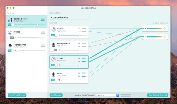
Flexible monitors in Loopback 2

Giving monitoring its own column made it possible to fully map channels and add multiple monitoring devices. We also allowed users to hide the column entirely if they don’t need to monitor their device.

Connection Wires

The connection wires also received a lot of polish. While they started out as simple straight lines, they eventually became elegant curves, which were more visually pleasing. Even better, the curved wires create visual groups which make the mapping easier to follow.


Evolution of the wires from early mockup to shipping app

Many More Small Changes

Many other things were tweaked, adjusted, and refined as we tested and experimented. For instance, we opted to make channels appear in pairs, as we realized odd-channel devices are rare (and there’s no real downside to having an unused channel).

We moved the device’s on/off toggle to be more logically placed next to the device name. The “on” state was also toned down, because it needs less attention, while the “off” state was given more color to draw the eye.

As well, we de-mint-ified the app, removing the green background and other green elements. This provided better emphasis to the more important parts of the interface, where color was used in a more exacting fashion.

Going from that first high-fidelity mockup to the shipping version of Loopback 2 required quite a bit of time and effort. Getting the details right took many more iterations, before we could eventually call Loopback 2 finished.

Shipping It

The culmination of this work recently shipped as the completely re-thought Loopback 2. While this upgrade offers many new features, the most obvious change is of course the overhauled interface. Here’s a direct comparison between old and new:


The original Loopback 1 was powerful but extremely utilitarian in design.


While Loopback 2 is polished and refined, to provide both power and ease-of-use.

As you can see, Loopback 2 replaces the previous version’s spreadsheet-esque look with a more intuitive wiring-based interface. It’s now easier to understand how audio will flow through a virtual audio device, and this visualization makes Loopback easier to grasp as a whole. That should make Loopback accessible to even more users, all without sacrificing anything in the way of functionality.

The Future

To paraphrase a line often attributed to da Vinci, software is never finished, only shipped. Loopback 2.0.0 has now shipped, but there are still many more updates and enhancements we hope to make in the future. The new and improved design found in Loopback 2 should provide us with a solid base to build on for years to come.

Halloween Fun with Farrago and Airfoil

Create a fun and spooky soundscape for Halloween, using Farrago and Airfoil

Before it was even October, my kindergartener son decided we ought to decorate for a truly spooky Halloween. Our concept: a scary cauldron which kids reach in to to retrieve their candy, complete with smoke and lights.

I took it upon myself to start on the (often overlooked) sound design. Spooky audio is an important component of any scary display or haunted house, and with today’s portable speakers, it’s easy to add. I’ll be placing a couple of small wireless speakers outside to play music and scary sound effects. As you might have guessed, I plan to use Rogue Amoeba apps to help.

Making Background Music

First up, we need some creepy ambient music. Finding something pre-made online is easy, but it’s even more fun to make this ourselves. I previously used GarageBand to make the example music loops we ship with our soundboard app Farrago, so I knew it would work well here too.

I started by making a new GarageBand project in a minor chord, and set the tempo to the slowest possible speed, five beats per minute (BPM). Then I added a bunch of loops and turned up the reverb. In about half an hour, I had made a pretty decent backing track. Almost everything sounds creepy at five BPM, so a little trial and error should be enough to arrive at something suitably unsettling.


Everything sounds eerie with these settings in GarageBand.

Samples like Bells, Choirs, Pads, Organs, and Vox all seem to work well. On top of that, the pitch-shift, echo, and reverb filters are useful to make them sound extra spine-chilling.

I encourage you to experiment and make your own audio, but you’re also welcome to use my audio file.

Here’s a short excerpt so you get the idea:

To get the whole file: Click to download (15 minutes, 11 MB)

Setting Up Sound Effects with Farrago

The music will serve as a backdrop, but I also want to be able to play spooky sound effects on demand. Here’s where our soundboard app Farrago comes in. I downloaded a bunch of sound effects from FreeSound.org and put them into a new set in Farrago.

First up, I added a bunch of on-demand effects. These are unsettling growls, howls, and cackles which I can play at random. I then added a bubble sound effect, to help sell my cauldron. Finally, I put in the spooky music file I made in the last step with GarageBand. I set the music and bubbles to loop, so they’ll provide he backing track and run continuously.

One great advanced feature of Farrago is MIDI triggering, which I’ll use to avoid the need to carry my 27” iMac to the front door of the apartment. The iMac can instead remain on my desk, running all the audio behind the scenes, while I control it remotely with an iOS MIDI trigger app on my phone.

I’ve set up an app called TouchOSC to control Farrago, though most any MIDI app should work. If you need help getting your iOS device talking to your Mac, this link should help.

Sending to Speakers with Airfoil

Farrago isn’t the only Rogue Amoeba tool I’ll be using. I’m also going to use our home audio streamer Airfoil to wirelessly send the desired audio from my Mac to speakers set up outside my front door.

The two speakers I’m going to use for this are my HomePod and a bluetooth speaker. Airfoil is a big help here, as it can send in sync to both bluetooth and AirPlay.

I plan to set up my speakers around the entrance to my house, and then set them as outputs in Airfoil, with Farrago as the source. Streaming audio using Apple’s AirPlay introduces a slight lag, but it should be plenty speedy enough to get some good jump scares.

In Airfoil, I just select Farrago as my source, and then click the Transmit buttons next to my desired outputs.

Audio is now streaming to my HomePod and Bluetooth speakers – perfect!

Getting It All Together

At this point, I have everything I need for the 31st. When the time comes, I’ll set my custom creepy music and bubbles playing on a loop, and use the MIDI app on my phone to trigger sound effects remotely. The sound coming from multiple sources in sync creates a very cool effect, like the sound is coming from everywhere, and is going to help sell the creepy vibe. A smoke machine, coloured lights, and creepy decorations from my son will bring it all together and make good creepy fun for all the neighbourhood kids.

Happy trick or treating!

Animating CSS Gradients, One Frame at a Time

Animations with CSS can be a powerful trick.

While working on the recent launch of Airfoil 5.8 (with Sonos support!), I wanted to visually convey the idea of wireless broadcasting by using the tried-and-true pattern of concentric circles. To really sell the effect, I wanted these circles to animate when the mouse cursor was hovering over them. This took some doing, but a bit of inspiration from my childhood got us where we wanted to be.

Getting Started with Gradients

The easiest way to display concentric rings is a simple radial gradient, done in CSS. CSS gradients are a lightweight way to add all sorts of visual patterns to the web. This means not just the smooth gradual changes between colours generally associated with the word “gradient”, but also lots of other repeating patterns.


This is the desired look, but I really wanted these radial circles to move.

Gradients are super useful, but they’re usually about as animated as a Moai. Unlike many other web elements, you can’t just set the start and end states, then have the browser interpolate out a smooth animation. I expect this will one day work in the major browsers, but for the moment it’s not supported.1

Stop Motion Inspiration

To get the animation I was after, I reached back into my childhood. Long ago, in the days of VHS, I made stop-motion animations with my family’s clunky camcorder. I would painstakingly build a tiny set and characters out of clay, then move it all very slightly, to animate a scene one fraction of a second at a time. It was arduous, but much like CSS now, I had to work with what I had.


A still frame of an unlucky Play-Doh guy getting hit in the head with a snowball, circa 1992 or so. Sorry Pixar, I went into software design instead of animation.

I realized we could put a new twist on that old stop-motion technique, by writing out CSS to create one frame at a time, then using the animate function to cycle through them. It would work a lot like those old animations I used to make, but with the “frames” created from code instead of images.

Animating with CSS

Doing this in CSS requires two steps. We first defined our frames using the @keyframes function. After that, we applied the animation to our banner with the Animate function, which defines how the frames will play.

Step 1: Defining The Necessary Frames

The good thing is that the CSS needed to generate each frame of our animation was relatively straightforward, though quite repetitive. We simply incremented the progress count by 2%, and the radius of the ring portion of the gradient by 1px each frame. My co-worker Lee made a quick script to brute-force generate the 51 frames in our loop, which we then placed in the related CSS file.2

I won’t show all the frames here, as there are too many, but here are the first two frames as an example. One thing worth noting is that we actually built the animation with the rings radiating outward, because the math was slightly easier. In the second step, that animation is reversed, to get the desired effect.

Here’s the first (0%) frame of an animation I’m naming waves:

@-webkit-keyframes waves {
0% {
background: repeating-radial-gradient( 15% 50%, circle, #E5F8FF, #E5F8FF 0px, #B8DDED 0px, #B8DDED 2px, #E5F8FF 0px, #E5F8FF 52px);
}

This code may be a little complicated to the uninitiated. It sets the repeating background gradient we want, with the size of the inner ring at 0px, and a total width of 52px. We need to increment the radius of the inner ring by 1px for each frame, to make the rings move a single pixel outward (remember, we’ll reverse it later). So, the second frame looked like this:

2% {
background: repeating-radial-gradient( 15% 50%, circle, #E5F8FF, #E5F8FF 1px, #B8DDED 1px, #B8DDED 3px, #E5F8FF 0px, #E5F8FF 52px);
}

There are another 49 frames, omitted here in the name of brevity, which increment the ring size by one pixel per frame until we hit 100%.

Step 2: Making Those Frames Move

The above code creates the individual frames which will result in our desired animation. However, we still have to define how they will animate. HTML and CSS keeps the animation and the definition of how it plays separate in the name of reusability. Making this animation apply to our banner was then as simple as adding the following bit of CSS of our banner element:

.banner:hover {
animation-name: waves;
animation-iteration-count: infinite;
animation-duration: 1s;
animation-direction: reverse;
}

This last bit of code is equivalent to the playback controls, and defines aspects such as speed, iteration count, and direction. By separating the actual animation elements (the frames and instructions), from the playback controls, you could very easily apply the same animation to different elements, but with different playback parameters.

A good example of how this separation is useful is that our animation frames are built in the opposite direction of how we wanted them to run, so we’ve specified in the playback controls for them to run in reverse. If I wanted it to run the other way, or even ping-pong back and forth, I wouldn’t have to define a whole new animation, I’d just edit these playback controls.

Our End Result

Here’s a slightly modified version of the banner which appeared on our front page. To better show the effect, this version doesn’t require hover to animate:

Stream to Sonos

Airfoil now sends to Sonos’s
AirPlay-compatible speakers

As you can see, our CSS animation got us what we wanted. The concentric rings draw via CSS, and are then animated inward, representing audio streaming to these devices. CSS gradients and animation allowed me to achieve the effect I wanted, while remaining very lightweight. The frames are only about 15KB in total, a pittance for an animation in today’s world of overweight web pages.

I’m very happy with this result. This was an effect I’ve wanted before, but I hadn’t previously figured out the right approach. There’s a good chance you’ll see this technique used again before too long on our site. Perhaps you can make use of it yourself as well!


Footnotes:

  1. Surprise kudos to Microsoft, because the current version of Edge does support this type of animation. ↩︎

  2. 60 frames would have been ideal, to fit into the 60 frames per second most computers display. However, CSS keyframes are defined as percentages, which makes it difficult to define keyframes that don’t fit easily into 100. A bit more math may have made it possible to get the animation to take exactly 60 frames, but 51 frames wound up working quite well, with less work. ↩︎