
The Design of Loopback 2
Enjoy a behind-the-scenes look at the design process for Loopback 2.
Posted By Neale Van Fleet on January 2nd, 2019

When we shipped the first version of our audio routing tool Loopback in early 2016, its powerful technology was packaged into a somewhat stripped-down interface. Because we were uncertain how large the market for this tool would be, we chose not to devote too much time to the front-end of that initial release.

Loopback’s first design got the job done, but it was plain and not very intuitive.
By Loopback’s first birthday, it was clearly a hit with audio professionals and hobbyists alike. We knew it was time to begin planning how to flesh out the skeletal Loopback 1 into a much more refined version 2.
Initial Thinking
We knew we wanted users to have an easier time understanding and using Loopback, while also having access to even more functionality. Power and ease-of-use tend to be countervailing forces in interface design, so these requirements meant we had our work cut out for us.
The first step in our redesign was boiling down Loopback to its essential components. Loopback creates virtual audio devices, and these virtual devices consist of three logical parts: audio sources, output channels, and monitors. Our challenge was to determine how best to arrange and connect those parts, so configuration would be both easy to understand and extremely flexible.
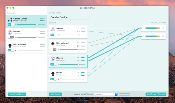
Back in 2015, we brought an updated UI to our recording tool Audio Hijack. This block-based interface allows users to see how audio flows through their specific configuration, and it was very well-received.

Audio Hijack 3 shows audio flowing visually.
Knowing how well this “nodes and wires” concept had worked for Audio Hijack made it an early favourite for Loopback as well. However, we wanted to consider other options to see if a different design would suit Loopback better.
Failed Concepts
I often sketch out multiple ideas so we can do head-to-head comparisons, which tend to be a productive way of evaluating options. While these low-fidelity sketches are very rudimentary, they still helped us determine how we wanted to proceed.
Rejected Concept: Channel Checkboxes
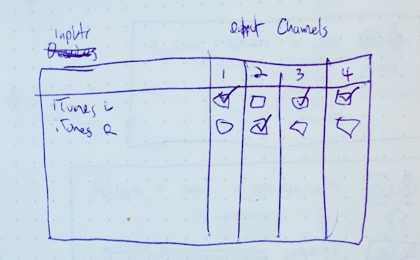
This idea involved having each source channel on its own line, with output channel checkboxes available for that source. Above, you can see “iTunes L” (for iTunes’ left channel) and “iTunes R” (for iTunes’ right channel), with four output channel possibilities. Configuration isn’t too terrible with a small number of sources and output channels, but even slightly complex devices would quickly require dozens of checkboxes to configure. Worse, most devices would require a good deal of analysis to understand. This one didn’t really leave the drawing board, thank goodness.
Rejected Concept: Grid Outputs

Here, output channels would be represented by a space on the grid. You could drag sources to the output you wanted. Channels that were paired (like the left and right of most sources) would have a line between them to denote the link.
Even as I made this, I realized it had severe issues. It was very difficult to parse how audio would flow through a device, and monitoring would have required an additional step in the interface beyond this grid. The fatal flaw, however, was that splitting sources into multiple channels would require creating many copies of each source, which would quickly get out of hand.
Selecting Our Final Concept
The aforementioned concepts, and others like them, scaled poorly for complex devices and didn’t lend themselves to easy scanning. Eventually, we returned to our early idea of nodes and wires.

This very early sketch of Loopback 2’s wires isn’t too far off from what shipped.
This wire-based approach was our clear winner, working well for simple devices and complex ones. Importantly, this layout offered space to add monitors and volume controls, and provided an easy-to-understand look at how audio flows through each step of a virtual device in Loopback.
Refining the Design
Of course, determining the fundamental layout of the app was really only the beginning. There was still lots of additional work required to turn those rudimentary sketches into mockups representing a real app.
I used Apple’s Keynote presentation tool to rapidly test how the product would work, creating many quick prototypes. The sketch below helped visualize how wire connections would be created automatically when a new source was added to a virtual device:
Starting from my rough sketches, I began to create higher-fidelity mockups showing the application in action. Here’s the first serious iteration of what would become Loopback 2’s design:
This minty green mockup looks similar to what we eventually shipped, but we were still relatively early in our process. When I compare this against our final product, I can spot dozens of changes, big and small.
More Powerful Monitoring
Early on, it became obvious that our design offered very powerful mapping to output channels, but an underwhelming monitoring function. That above image shows a single monitor available in the bottom bar, with no channel adjustments possible. Our earlier wire sketch had shown a more robust monitoring column, and we determined that this was worth adding back.
 Flexible monitors in Loopback 2
Giving monitoring its own column made it possible to fully map channels and add multiple monitoring devices. We also allowed users to hide the column entirely if they don’t need to monitor their device.
Connection Wires
The connection wires also received a lot of polish. While they started out as simple straight lines, they eventually became elegant curves, which were more visually pleasing. Even better, the curved wires create visual groups which make the mapping easier to follow.

Evolution of the wires from early mockup to shipping app
Many More Small Changes
Many other things were tweaked, adjusted, and refined as we tested and experimented. For instance, we opted to make channels appear in pairs, as we realized odd-channel devices are rare (and there’s no real downside to having an unused channel).

We moved the device’s on/off toggle to be more logically placed next to the device name. The “on” state was also toned down, because it needs less attention, while the “off” state was given more color to draw the eye.

As well, we de-mint-ified the app, removing the green background and other green elements. This provided better emphasis to the more important parts of the interface, where color was used in a more exacting fashion.

Going from that first high-fidelity mockup to the shipping version of Loopback 2 required quite a bit of time and effort. Getting the details right took many more iterations, before we could eventually call Loopback 2 finished.
Shipping It
The culmination of this work recently shipped as the completely re-thought Loopback 2. While this upgrade offers many new features, the most obvious change is of course the overhauled interface. Here’s a direct comparison between old and new:
The original Loopback 1 was powerful but extremely utilitarian in design.

While Loopback 2 is polished and refined, to provide both power and ease-of-use.
As you can see, Loopback 2 replaces the previous version’s spreadsheet-esque look with a more intuitive wiring-based interface. It’s now easier to understand how audio will flow through a virtual audio device, and this visualization makes Loopback easier to grasp as a whole. That should make Loopback accessible to even more users, all without sacrificing anything in the way of functionality.
The Future
To paraphrase a line often attributed to da Vinci, software is never finished, only shipped. Loopback 2.0.0 has now shipped, but there are still many more updates and enhancements we hope to make in the future. The new and improved design found in Loopback 2 should provide us with a solid base to build on for years to come.


You must be logged in to post a comment.